
imagining america: graphic identity
overview
WHAT
Imagining America is a non-profit organization started by the White House in 1999, dedicated to promoting arts and scholarship in public life. After 20 years, the organization felt it was time for a rebrand.
team + my role
This project was completed with 4 other teammates: Jamie Oka, Pattie Chen, Margot Uchicua, and Katherine Lin, under the guidance of Professors Brett Snyder and Glenda Drew. The entire process was extremely collaborative, but my main responsibilities included assisting with logo development and branding.
deliverables
New graphic identity and marketing materials.

background + research
what is Imagining america?
Best summarized by the organization themselves, “Imagining America is a non-profit organization that brings together scholars, artists, designers, humanists, and organizers to imagine, study, and enact a more just and liberatory ‘America’ and world. Working across institutional, disciplinary, and community divides, IA strengthens and promotes public scholarship, cultural organizing, and campus change that inspires collective imagination, knowledge-making, and civic action on pressing public issues.”

research
During the research phase, we studied similar organizations, to see how they branded themselves, what was successful and what was not.
Why rebrand?
Imagining America’s current identity did not translate to the organization’s mission, values, and goals. The identity felt dated and dull and did not help with expressing the lively nature of the non-profit.
Logo used from 1999-2019
New logo, released June 2019
development

Logo process
The process to create the logo was extremely collaborative and iterative. Each week, we would come together with logo sketches which we would share with one another. Then we would hand of our sketches to another teammate, who would digitize it, and then pass it off to another teammate who would make their own adjustments. This process continued for many months, checking in with the IA team, getting feedback, and implementing the feedback, until the final logo was developed.


final logo + graphic identity
inseparable
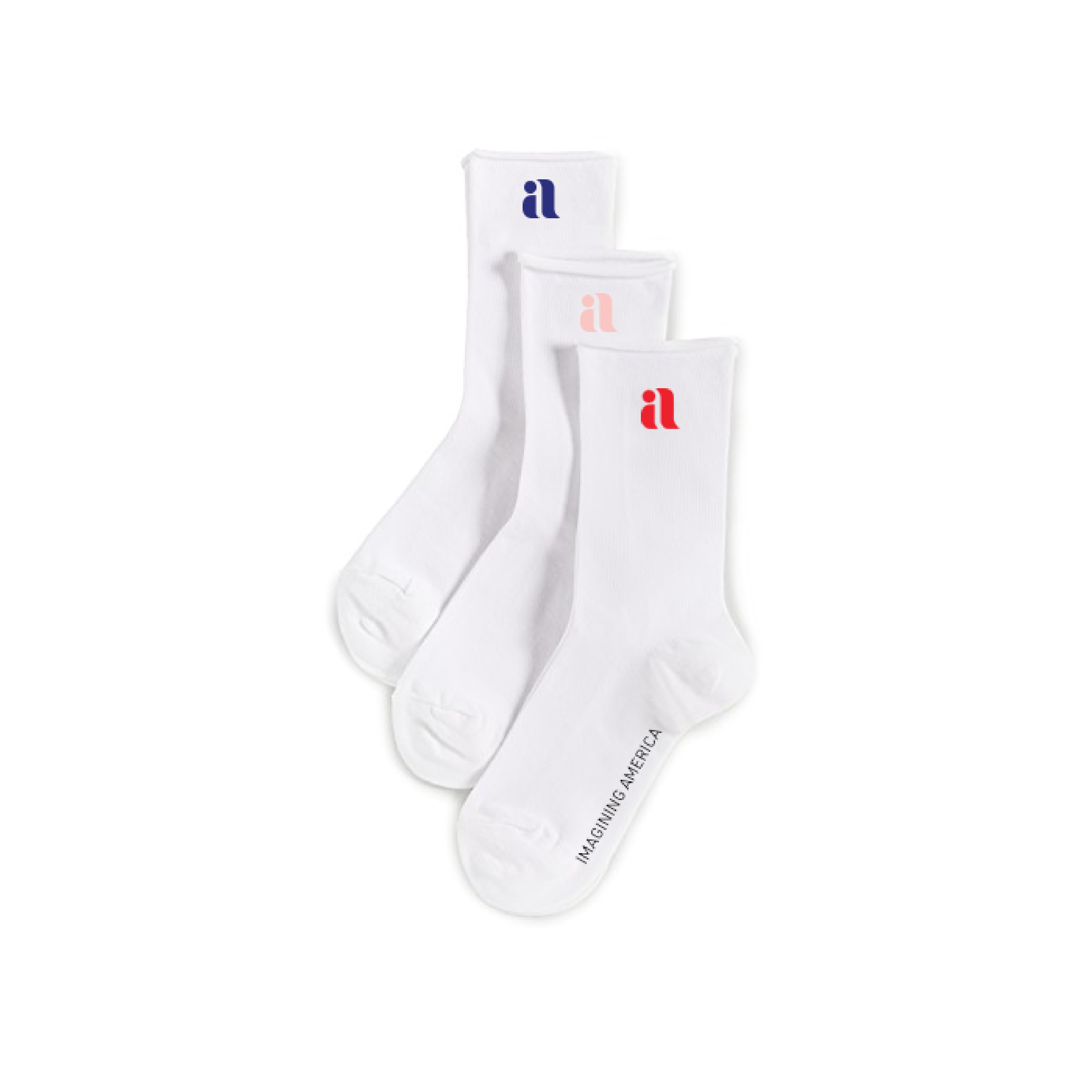
The logo that we landed on after hundreds of sketches fit Imagining America perfectly. The ‘i’ and the ‘a’ are one— imagination is so deeply ingrained in America, and the two cannot be separated. America is represented with the lowercase ‘a’, as the organization struggles with the idea of America, the weight it carries, and its histories. The negative space around the ‘i’ also creates and uppercase ‘A’, which further demonstrates that struggle.
The logo’s physical qualities have a handmade feel to it, almost as if it was created by the stroke of a brush, alluding to IA’s commitment to the arts.
We created 3 versions of the logo that could be used depending on the context: the logo mark, the logo and title, and the full lockup with the tagline as well.


Brand colors
Picking the colors, we felt that it was important that we did not pick colors that gave off a “patriotic” look. By picking many secondary and tertiary colors, we were able to create a unique color palette that afforded a variety of color combinations, keeping the identity continuously fresh.

MArketing pieces
To increase brand awareness, we created a variety of pieces that could be used by Imagining America to spread their mission.

Posters for the National Gathering in New Mexico


acknowledgements
Thank you to my professors Brett Snyder and Glenda Drew, my teammates Jamie Oka, Pattie Chen, Margot Uchicua, and Katherine Lin, and the Imagining America team.