
dear self, a self-care campaign
overview
WHAT
dear self, is a campaign that tackles the juxtaposition between self-care, and the image of self-care portrayed by consumerist culture.
my role
The project was completed with my 2 teammates, Katelin Hermone and Ana Petraglia, and was very collaborative. My main responsibilities included branding, and website design, and I assisted with art direction and strategy.
deliverables
Website, business system, posters, stickers, diary, tote bag, and zine.

background + research
why self-care?
Our team chose to create a campaign addressing the dark side of the self-care movement because it is an issue that is at the root of mental health. We not only wanted to expose companies for capitalizing upon such a trend, but we wanted to offer realistic solutions. Each of us personally feel that a self-care routine is an important aspect of our lives, but we wanted to stop spending our money on face masks and bath bombs. We decided that we needed to create this call-to-action campaign in order to make a change in how we, along with the rest of the generation, are “treating” ourselves.
our goal
The dear self, campaign is a hybrid of a call-to-action campaign and an informational campaign. We believe that neither one nor the other fit our mission as a campaign exclusively. As a team we decided that it was important to both provide information about the consumeristic nature of the current self-care movement while also calling out our audience to change their habits and routines in order to effectively improve their mental health.


Branding
Our branding took inspiration from beauty brands that capitalize on the “self-care” movement. We wanted to use millennial pink and other trendy colors, serif fonts, and minimal graphics. Our main source of branding materials are our photos. Because of this, we wanted our logo to be very simple and minimal. It is a versatile logo as well that can be used in many forms.
photography
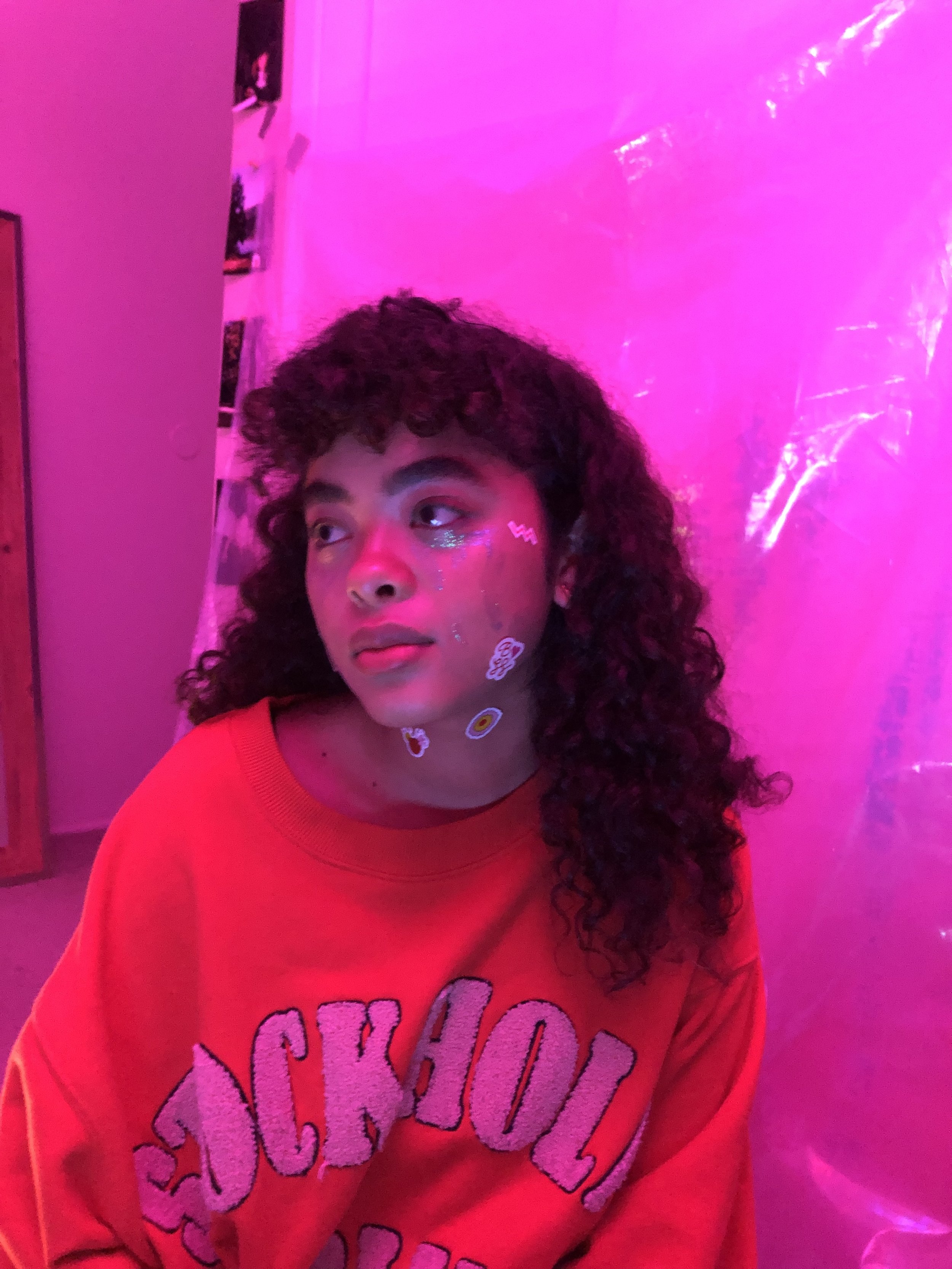
Rather than using illustrations or graphic materials, we chose to have photos as they would get our message across better. The idea for our photos was to have women participating in the commercialized self-care practices, however they were still sad portraying the fact that avoiding real issues can’t be pushed aside by doing a face mask or having a bubble bath.


marketing + strategy
Our campaign is heavily based on the belief that self-care should not have a price tag; therefore, the majority of our pieces are open access on the dear self, website: dearself.co. We want everyone to be able to personalize and customize their new and improved self-care routines. Other marketing pieces include posters, informational brochures, zines, stickers, and tote bags.
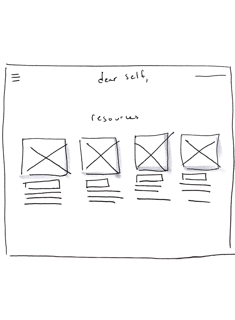
website
The website acts as the home base for the campaign, where users can learn more about healthy ways to practice self-care and access our resources. Visit our website to see it in action!
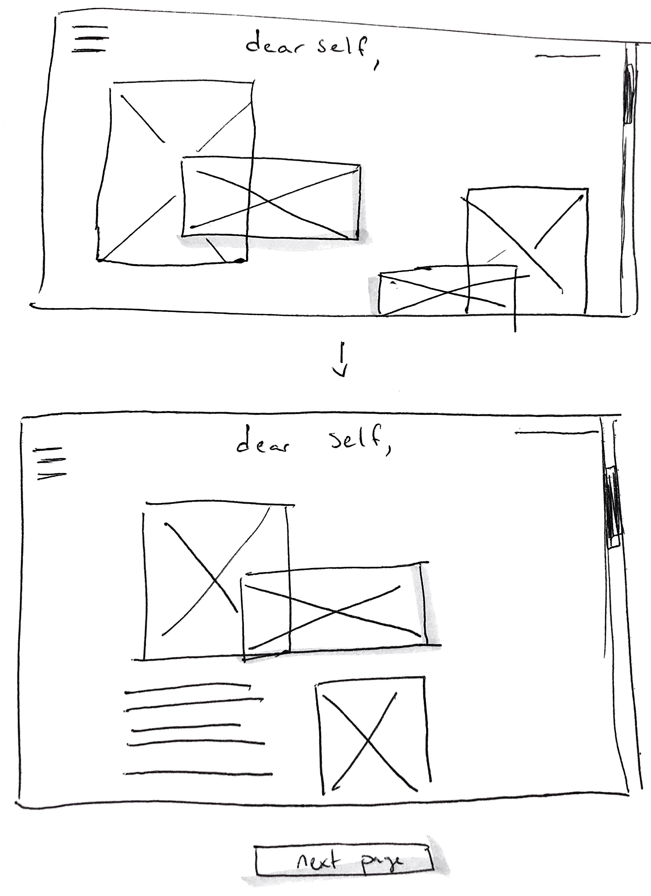

dear self, landing page

Scrolling down the site

Resources page
other deliverables


Behind the scenes


Process Manual
If you would like to read in detail about every step of the campaign, check out the process manual below!
Thank you,
Thank you to our professor Gale Okumura, our models Mika Ware, Emilia Tongson, Olivia Kotlarek, and our friends and family for tolerating us only talking about this campaign for the past 10 weeks.